 With so many different devices and screen sizes around web designers are presented with a problem when trying to design a site that looks well on a multitude of devices. Nowadays it’s quite common to see very high resolution computer displays on monitors of 27-30” or more but also people are accessing the web every day on their mobile phones and tablet devices.
The solution for this is to make sure that a website is responsive, this means that the same content will display in a different format depending on what size of screen you are using. On a large screen the layout will be what people expect from a website, but on small mobile devices the layout folds down so that the most important content is presented first, menus are folded down into a nested list and images will shrink to allow them to be fully viewed on the screen without part of the image being lost at either side.
Mobile friendly websites have become even more crucial recently with the announcement from Google that from April 2015 they’d give a higher ranking to sites that were responsive, so it’s an excellent way to get the edge on your competition.
We’ve got years of experience building responsive websites and the following example should show you how a site can display the same content perfectly on any screen size.

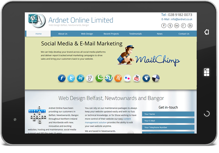
A more condensed version of the desktop screen size, at a landscape tablet size the full width of the content should be visible, though it’s acceptable to lose some of the background image to the left and right.

Pushing down further in width draws the items on the horizontal menu closer together and narrows the content rows, some content might start to flow onto two lines but photos and images should still remain in their place. Things get a little crushed on the header, but everything is still available at this stage.

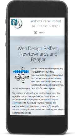
At the narrowest screen size the content is pushed into one column instead of two or three, images still appear but they are also made smaller to fit onto the smaller screen size. The menu is folded down into a small icon now, but if you press on the icon the full menu will appear, only this time in a vertical format. Remember all the same content is present on this page, it’s not a simple mobile version of the site, it’s the full size, just displayed in a compact form that search engines love.

